In the movie “If You Build It” the designers advocate for design through education. The two designers go into Bertie County and teach children useful and practical skills related to design; such as: cutting, measuring, and drafting. Other than coming in to the community and instructing the kids, the couple also gave back to the community. Their idea for the assignment was to have the youth of the community design a farmers market, then work together as a team to give the designed artifact to their community in effort to liven up the dying town. Design advocacy is often successful because it gives something back to the community, weather it is an actual designed artifact or knowledge or set of skills something is being given back to that benefits the well being of the community.
Design Autobiography
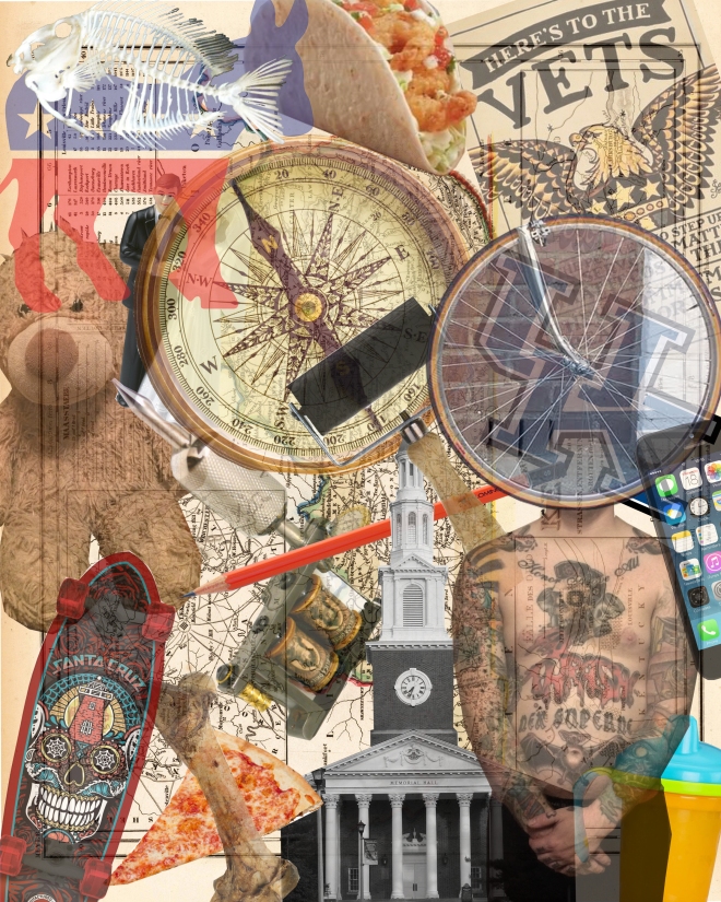
For my design autobiography i decided to take images of the artifacts i thought best represented me and collage them into one image. I considered this assignment in a way to be a self portrait which is the reason i chose to make a collage of my artifacts. I feel like also collage is a great medium to combine a series of images into one composition and allow the organization of the composition represent you. The 20 images I decided best represented me were:
a picture of my torso
a bike tire
Iphone
tattoo machine
memorial hall
UK logo
dog bone
santa cruz skateboard
my sons teddy bear
shrimp taco
fish bones
democratic donkey
veteran poster
sippy cup
kentucky map
compass
printmaking brayer
bride and groom cake topper
drawing pencil
slice of pizza
designer profiles 9-10
The first designer that spoke today in class was Randall Vaughn. Vaughn is a University of Kentucky Alum. and is the President of Architects and Engineers at Gray Construction. I thought the way he addressed the question about where do you see design in the world around you really uniquely. Instead of him giving a response to the question, he had the architects and engineers that work under him respond to the question. This provided numerous answers from individuals actively working in the field. The most common answer was along the lines of design happens everyday from the clothes you wear to the accessories you use, like mobile devices. There were 2 answers to this question i thought were really interesting and hand really heard yet during these designer profiles. Those responses were ” design can bring both order and chaos” and “Function is more important than aesthetic.” Both are really interesting and practical responses to looking at design around you. Vaughn thought that the future of design will allow there to be curators of multiple trades and various disciplines working together. Which is a similar response to some that we have heard in the other design profiles that have been given.
The second designer to speak was Helen Turner. Helen summed up her career in design as “opportunity.” She did her undergraduate degree at Ohio University and Graduate degree and the University of Cincinnati. In between undergrad and grad school she was fortunate enough to work for a couple smaller firms in the field to have some practical experience. After grad school she got a job teaching at the University of Kentucky and is currently still teaching in the College of Design. Her emphasis of study in on environmental friendly design. So in the world around her she sees design that is not polluting the environment. I thought this was interesting because i wasn’t aware that there were designers out there that are advocating for such a thing. She also sees design going in this direction in the future to be more resourceful with materials and less wasteful. I think if thats true it will be really awesome for the environment and may help create a movement with others to also be less wasteful and more resourceful.
designer profile 7-8
The first designer to present today was Tim Lucas. Tim got his start in design at a very young age, with his father being an interior decorator. So most of his young life he was around a lot of design as well as designers. As he got older he took mechanical drawing classes in high school which furthered his interests in design. In the 70s Tim started school at the University of Kentucky in a college of design studying architecture and graduated in 74. He has had several jobs working with design and architecture since earning his degree. he has worked with fits ranging from lexington up into Cincinnati and other areas near Ohio. In his presentation, Tim stated that he believes design is everywhere. It encompasses everything around us, from the clothes we wear, to buildings we enter, to other accessories that we use daily. When done well, design can literally be life changing to those who occupy the designed spaces and items. Like many of the other designers that have presented in the past week, Tim also believes that design in the future will move to more of a collaborative environment between design disciplines.
The second designer to present was Melody Farris-Jackson. Unlike Tim, she got her start in design later in her life. Starting out in college as pre-med she quickly realized she would like to do something a little more creative and transferred to the college of architecture. Since graduating she has held many titles in the design world, both locally and internationally. She has worked with several construction firms, done different local commissions and served as the Art Director for the equestrian games that were held in Lexington in 2010. Melody thinks that design in the world around us should give back. She came to this conclusion recently, working on a ball park that is made from rubber so that wheel chair bound people and others with disabilities can still participate in athletic activities. Like Tim, she thinks that design is heading in a collaborative path. She believes that in the future we will have “Archineers.” which is a blending of the architecture and engineering professions. With the influx of technology, melody believes that the lines will start to be blurred in the professions and many disciplines will be obtained.
Designer profiles 2 – 4
The first designer profile presentation given yesterday was by Adam Logsdon. When Adam was young, he enjoyed building with blocks and legos creating his own creations instead of following the directions. When he got to high school he enrolled into some drafting courses giving him a head start into the world of architecture. Adam currently is a grad student in the college of design studying architecture and is working at design firm drafting blue prints and floor plans for future projects. Adam believes that the future of design will incorporate more use of technology with 3D printing and digital fabrication. These technologies also allow more collaboration in the field of design.
The next design profile presentation that was given was given by Julie Sniadowski. Julie also got her interest in design from a young age with taking art lessons in drawing and painting. When she got to high school she also enrolled in drafting classes sparking her interest in architecture. Currently, Julie is a grad student in the college of design and is working on a design problem that involves ways to remove radiation from the grounds near the ohio river in Paducah, KY. Like Adam, Julie also believes that the future of design will be heavily influenced by the use of technology, such as drones and other machines that can assist in solving these design problems.
The final design presentation that was given was given by Heather Hemmer. Unlike the other two, Heather got her start in design at a later age. She became interested in design when taking an art class in High School. Before that she was really into sports and athletics. Currently, Heather is in her third year of design school and would like to move to San Francisco when done with her degree. She also has plans to travel abroad to study design in the winter and next summer. Heather thinks that the future of design is going where we are going. Which i would assume means in the direction of a very technologically based practice.
Museum of you
NAME your artifacts.
- Skateboard
- tattoo
- coffee
- Teddy bear or childs toy
- pencil
- Red, White, and Blue Donkey
- Printmaking Brayer
- Dog
- Wedding Ring
- Laptop
The artifacts i have listed above tell a lot about me as a person; who i am, what i believe in, and what i enjoy to do. I am a Father(Childs toy),husband (Wedding Ring), and a family man (dog), that grew up skateboarding and playing music. At a young age i was exposed to the arts and fell in love very quickly (Pencil, Tattoo) now I am studying (Laptop and Coffee) Fine Art and have developed a steady practice using printmaking (Brayer). Finally, I am very happily and open about have democratic political views (Patriotic Donkey). For the most part, These artifacts fit into an things group because the items i mentioned seem mostly like objects and not places and people, even though some pf the objects are listed in relation to people. Design factors in because a lot of these objects are catered to particular crowds with particular interests. I feel like a lot of these artifacts directly relate to me, they aren’t metaphorical.
Movie Review
Helvetica, Wall-E, and Everything is Illuminated are all uniquely and well designed. Helvetica is a documentary film about the typeface Helvetica and its use in graphic design. It explores the beauty of the type and its design and show how diversely it can be used because of its many different forms. Everything is Illuminated is a movie about a jewish boy who goes on a quest to look for the lady who saved his grandfather during World War II. Throughout the journey, Jonathan discovers a lot about himself and his history. Wall-E looks at a future world where Americans live in space because the world is so polluted because mass consumerism. In terms of design I think all of these can be connected through language.
In Helvetica, the movie is talking about a form of type which is a written language. The film looks at the design of the type from a psychological stand point, and why it is as effective as it is. I think that the whole design of the video is to bring light to this world of type. Everyday we pass numerous signs and buildings with type on them, and never really stop to think of the complexities of what all goes into something that seemingly as simple as type. Its so easy to be quick to think that fonts or just something generated on the computer, when in reality it all starts with one single individual drawing and laying it out on paper.
Everything is Illuminated is a movie that uses artifacts that support the design of the film. Throughout the film Jonathan collects artifacts or items that will help him along his journey. As the movie progresses it seems these items come to represent him. Therefor these artifacts began to communicate something about the character. This design communicates that often time when we are on a journey to find one thing we can unexpectedly stumble into new discoveries.
The movie Wall-E takes a satirical point of view designing a world in which man made items have taken over. Overall the movie is designed to communicate that we need not put the blame on everyone else and take responsibility for our own doings. Of course because it is designed to be a family movie, they come together and save the planet.
As said early, the biggest similarity with all these movies is the design in their use of language and communicating main ideas. However, there are a lot of differences in the movies. The biggest difference being the genre of what each film is. One movie is an independent documentary, one movie is a high definition animation and finally, one being a drama. Another difference is the way in which they go about using language as mentioned above. One looks at it from a psychological stand point, one from a satirical stand point, and the last one from the use of artifacts as a means of self representation.
From watching these films, I learned that you can use the same key ideas and communicate it in many different forms and from several different stand points. Design can be used in many ways to essentially communicate the same thing but provide many different means of that particular communication.
Analysis 9 & 10
The ninth movie I watched and will analyze will be Logan Dortch’s video on the Southeast Christian Church. My first feeling of the church was a little shocked at its sheer scale and the amount of commodities that are in it. Logan did a great job at covering all five main points that were required to cover. Each point is discussed clearly and effectively. I found the most interesting point to be that from a social stand point that church provides many different levels of worship, catering to children and adults of all ages.
I think that the video was made really well. I like all the aerial photos that were included to really show the scale of the church. I also enjoyed that the creator narrated his video with a script and had clear images that where that right resolution.

The final movie that i analyzed was Breden Gibson’s movie on Madison Square Garden. Like most, Breden starts the movie off with a history of Madison Square and the reasons why it was built. I think all 5 points where discussed but maybe could have been made just a little more clear. The best point i thought that was made was how the garden affects the human experience. The building can affect human experience on so many different levels, from hosting concerts to various amount of sporting events.
I think that the video is made very very well. The creator did an excellent job organizing the appropriated video and making sure all the imagery was clean and interesting. I also like the audio choices that were chosen because it really amped up the tone of the video and made the building seem a lot more fierce than it may be. The only thing i would potentially change about the video is narrating it. The words popping up in the bottom of the video sometimes are hard to see and read while also looking at imagery. Other than that small detail, I think the video was very well made.

Anaylsis 7 & 8
For my seventh analysis of the informance movie i watched Spencer Anderson’s movie about the Emirates Stadium. I like that the creator started the video discussing the construction of the building and the economic value of it instead of just the history. The creator also discusses all 5 main points clearly in his film. I think the best point that was covered was how the stadium enhances the human experience. I like that he looked at the design of the stadium from the view point of the fans and less of how it pertains to soccer.
From a creative stand point, I think that video was done very well. All the images used are very clear and not pixelated. I liked that there was actual shot video that i assume the creator took while visiting the stadium and one time.

The 8th informance movie that i analyzed was Emily Bramel’s video about Keeneland. Right from the beginning i was intrigued by the video and thought it was awesome that the audio was the infamous trumpet that is played before the races start. Like several others, Emily starts the video off with a history of Keeneland. She does a good job at covering all five main points clearly and effectively. I found it interesting when talking about social and cultural practices that you could get married at Keeneland. Before watching the video i was unaware you could do this.
From a creative stand point, I think that the video is very successful and is very well made. The creator did a good job with using clear images and maybe even some of her own images that she has captured in her experiences at Keeneland. One thing I would have liked to have seen differently is the text actually be narrated instead of put in with the video.

it’s FONT-amental
 \
\
The first item with type on it that i found was this bottle of Famous Daves BBQ sauce located at the Euclid Kroger. I chose this item because it was working with three different typefaces in a row. The first font on the bottle is the signature Famous Daves font that is used in all of their products. It is a script influence font that i feel was chosen to resemble a sauce that is sophisticated and professional, but also classic. The next font on the bottle is the words BBQ Sauce. The font looks to be a block lettered font with a warm color gradient spanning across the letters. I feel like the color of the font indicates a warm summer day or the idea of a hot grill rather than the actual font itself. Finally, the last font on the bottle is the words Devil Spit, which is the type of sauce that it is. It is a font that is influenced from an old english font. I think the designer chose this font because it gives the idea of old time or religion like items and the product is “Devil Spit.” I also think that this font was chosen because it looks a little wicked or spooky like the thought of the devil.

The next font i found interesting was the font used for the Sunesis Environmental I chose this font because although the logo works as a whole, putting so much emphasis on the separate “S” leads me to believe that that part of the type maybe used as a logo by itself. The font in the Sunesis is black and bold helping it stand out on the sign. The background of the “S” and the Environment is all in green. I think this color choice was chosen because it relates readers back to the environment and that this company conducts an environmentally friendly business. This font can be found on the fence in front of the demolition site of the student center.

The next font i photographed was the Campus Cafe sign that can be found on the corner of Rose St. and Euclid. The font that the designer has used is a varsity influenced typeface. I think that the designer made this choice in type because it relates to lifestyle and ideas portrayed in movies of “Campus Life” and College Athletics. I think that the font is a good choice because it is legible and appeals to the audience that is eating there. I also think the designer made a good choice in color because it relates to the Universities colors also making it more appealing to college students looking for lunch in that area.

While on my way home, I found this font on the front of the Kenndys Paw Prints Screen Print Shop building. It can be found attached to the Kenndys Wildcat Den. I liked this font because it is influenced from a Modern Serif type face. I think the designer made the choice to use this font because it makes the business seem productive but also small time. The font is slim and somewhat bunched together giving it more of an old fashioned or mom and pop shop feel implying that the experience of doing business there will be intimate. The choice of the white on the window helps the font stand out and be legible to those passing by either on foot or in a vehicle.

The last font i chose to photograph is the new School of Art and Visual Studies sign hanging outside of the building. The font is a Sans-Serif typeface that looks to be a Helvetica or Helvetica New influenced type. I think the font is successful and when driving passed the building it stands out. I think that the designer chose that type on the sign because the building is new and this particular font makes it appear to be super modern and trendy. Helvetica Type is the most widely used font in design and is extremely popular among modern graphic designers. I think by using white, it pushes the type away from the background colors giving onlookers a better understanding of what is being advertised or communicated.
